


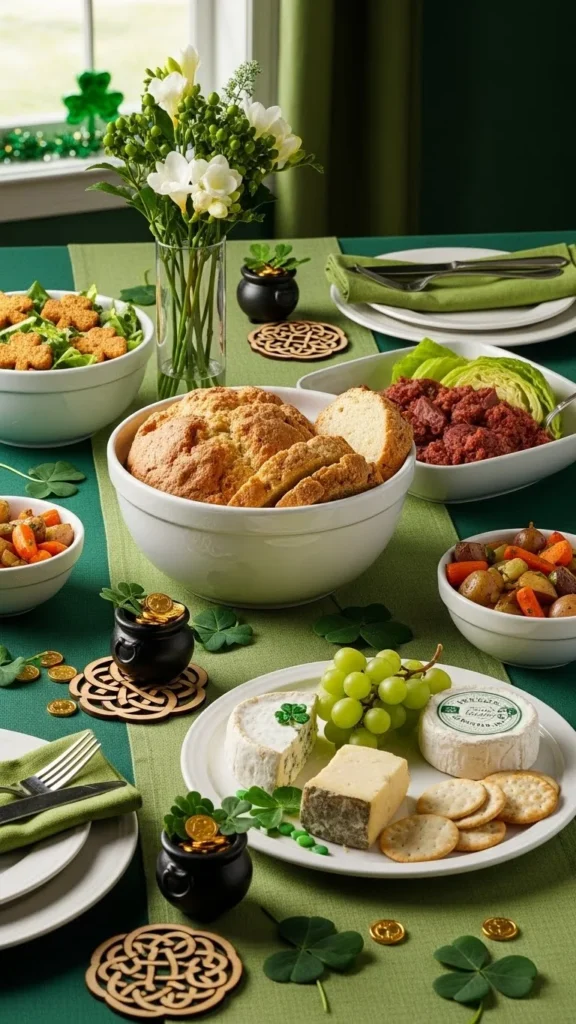
St. Patrick’s Day tables can feel polished and intentional without looking themed or overdone. The key is thoughtful layering, restrained color, and details that feel curated rather than store-bought. This list focuses on table decor that looks designer-styled but stays realistic for real homes. You’ll find ideas that rely on texture, repetition, and smart styling tricks—many using items you already own or can DIY for very little. Each idea works beautifully on its own or layered together for a table that feels planned, calm, and quietly celebratory.
1. Soft Green Linen Tablecloth Layers
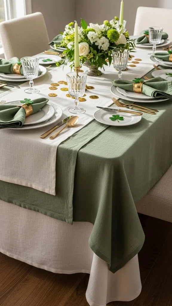
Layering linens sets the tone before anything else touches the table. Start with a neutral base cloth in ivory or warm beige. Add a soft green runner or second cloth laid slightly off-center. The casual wrinkles make it feel relaxed rather than stiff. Linen always photographs well and instantly gives that designer mood.
Budget tip: Use linen-look cotton tablecloths or thrifted sheets. Wash and air-dry to keep natural texture. For smaller tables, scarves or fabric remnants work just as well.
Keep the rest simple so the layers stand out. Neutral plates, clear glassware, and minimal center decor allow the fabric to do the visual work. This setup works for brunch or dinner and pairs easily with gold or ceramic accents later.
2. Gold-Rim Charger Plates

Charger plates instantly add structure to a table. Gold-rim styles feel refined without feeling flashy. They frame each place setting and create rhythm across the table.
Budget tip: Look for plastic or melamine chargers with a metallic edge. Spray-painting thrifted chargers with muted gold also works well. Keep the gold soft, not shiny.
Pair chargers with plain white plates and simple folded napkins. This keeps the look grounded. Chargers work especially well on darker tables where the contrast feels intentional.
3. Monochrome Green Napkin Styling
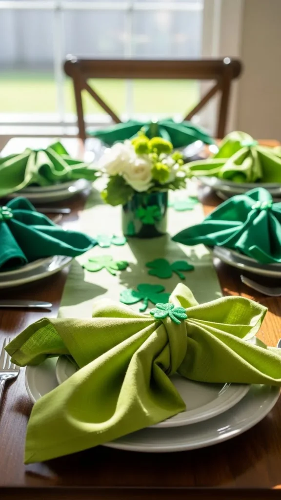
Using one color in multiple tones feels styled rather than themed. Choose napkins in sage, olive, moss, or eucalyptus shades. Each place setting can vary slightly.
Budget tip: Mix napkins from different sets. As long as the tones stay close, the variation looks planned. Cloth napkins from thrift stores are often easy to dye.
Keep folds simple. A loose rectangle or knot feels more current than complex folds. Place napkins directly on plates or slightly off to the side for a relaxed look.
4. Minimal Gold Flatware
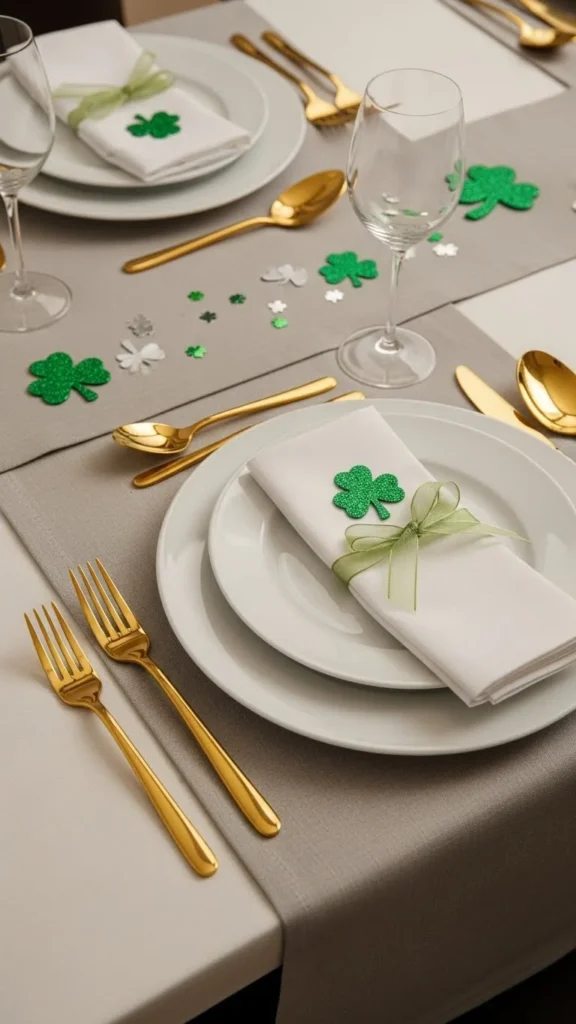
Gold flatware adds warmth and contrast without extra decor. Choose slim, simple designs. Avoid heavy patterns that compete with other elements.
Budget tip: Matte gold flatware sets are widely available and often affordable. You can also mix gold forks with stainless knives for balance.
Align flatware carefully for a clean look. Even small details like spacing matter. This is one of the easiest ways to make a table feel intentional.
5. Low Greenery Centerpiece
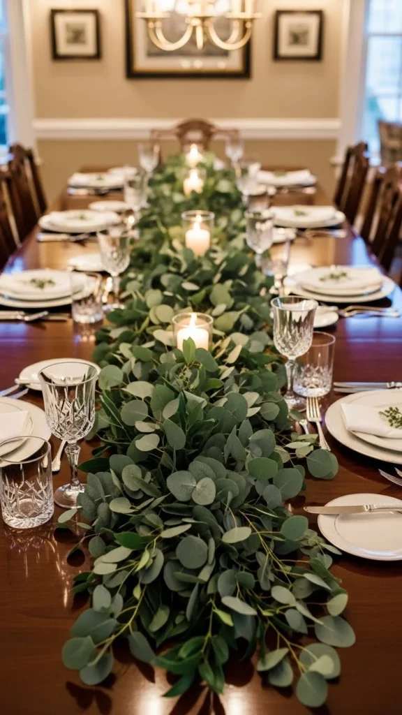
A low arrangement keeps conversation open and feels more refined than tall pieces. Use greenery rather than florals for a calmer look.
Budget tip: Faux greenery works well when kept simple. Lay stems loosely rather than stuffing them tightly. Even grocery-store greens look great when spread out.
Let the greenery trail naturally along the table. Add small gaps so it doesn’t feel heavy. Candles or small accents can sit within the greenery for balance.
6. White Ceramic Serving Pieces
White ceramics ground the table and give everything else room to stand out. They also photograph beautifully in natural light.
Budget tip: Mix pieces from different sets. As long as they’re white or off-white, the variation feels collected.
Use serving pieces as decor even before food arrives. Stack bowls or lean platters against the centerpiece for dimension.
7. Stoneware Accent Bowls
Stoneware adds texture without extra color. Choose pieces with matte finishes or light speckling.
Budget tip: Individual stoneware bowls are easy to find at discount stores. Even mismatched styles work when the palette stays tight.
Place bowls evenly across the table to create rhythm. They can hold small items or remain empty as sculptural accents.
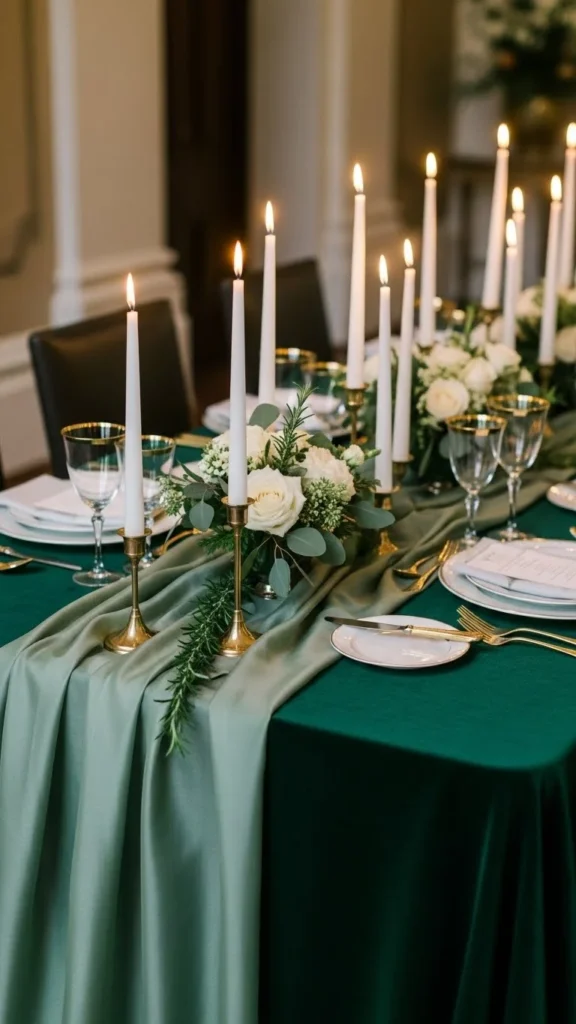
8. Brass Candle Holders
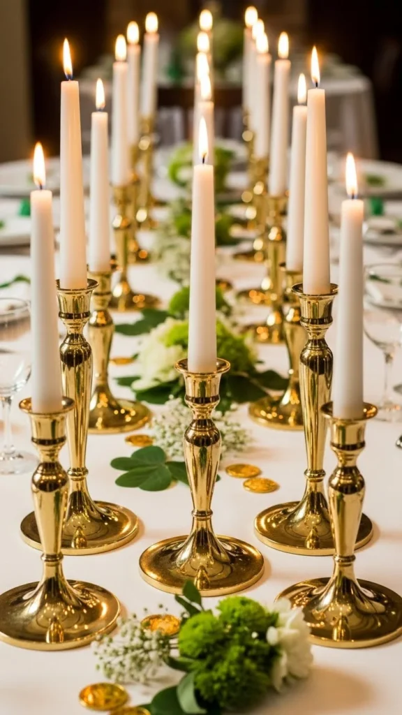
Brass adds warmth and works well with green tones. Stick to simple shapes.
Budget tip: Thrifted brass often just needs a gentle clean. Avoid polishing too much—soft patina looks better.
Keep candles white or cream for balance. Space holders evenly to keep the look calm.
9. Neutral Place Cards on Handmade Paper
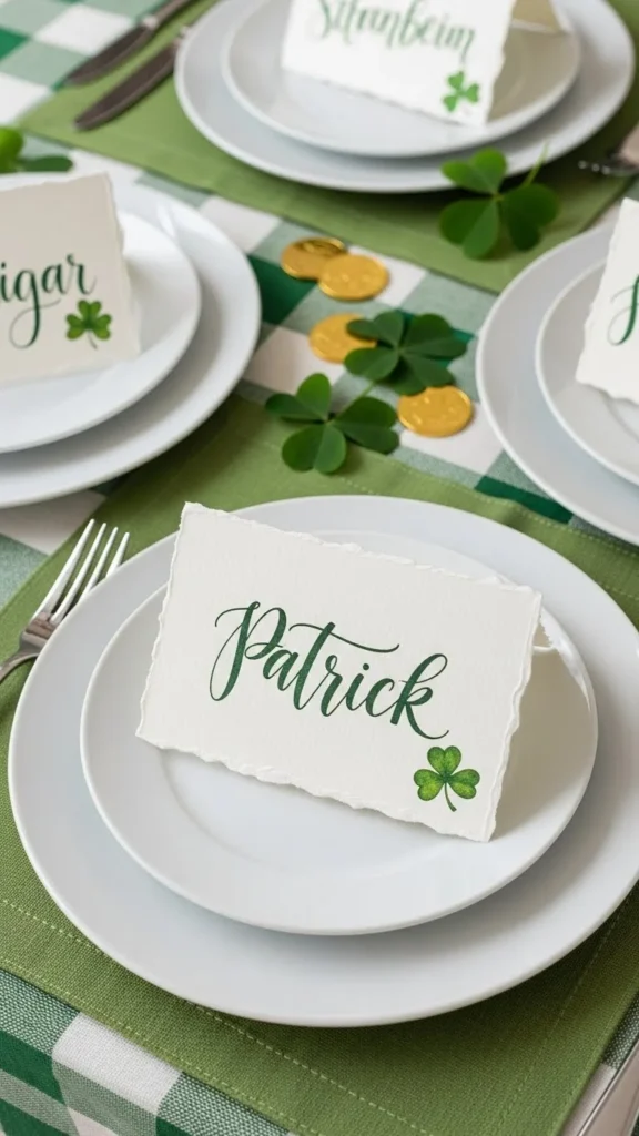
Place cards feel personal without being themed. Use handmade or textured paper in neutral shades.
Budget tip: Cut paper from craft sheets or recycled stationery. Write names with a simple pen.
Lean cards against plates or napkins for an easy setup.
10. Marble or Stone Coasters
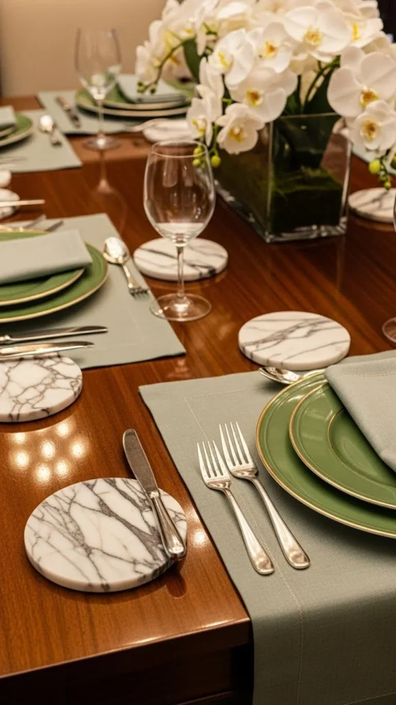
Stone elements add weight and contrast. Keep shapes simple.
Budget tip: Tile samples work well as coasters. Felt pads on the bottom protect surfaces.
Place them consistently at each setting for balance.
11. Green Glass Votives
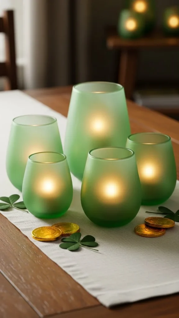
Colored glass adds mood without extra decor. Choose muted green tones.
Budget tip: Collect mismatched votives in similar shades. Group them in small clusters.
Use evenly spaced groupings to avoid clutter.
12. Linen Napkin Rings

Fabric napkin rings feel softer than metal.
Budget tip: Make rings from ribbon or fabric scraps tied loosely.
Keep styling relaxed rather than tight.
13. Wooden Serving Boards
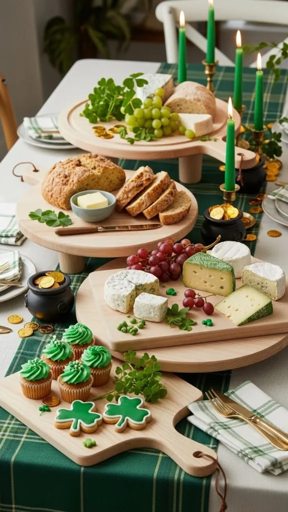
Wood adds warmth and balance.
Budget tip: Use cutting boards you already own.
Lean boards against center decor when not in use.
14. Neutral Runner with Subtle Texture

Texture matters more than pattern.
Budget tip: Waffle or gauze fabrics work well.
Center the runner loosely.
15. Simple White Candles
White candles keep the palette calm.
Budget tip: Buy in bulk.
Trim wicks for a clean look.
16. Ceramic Clover Accent
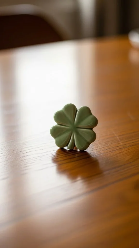
A single nod to the theme feels intentional.
Budget tip: Clay air-dry pieces are easy to make.
Use sparingly.
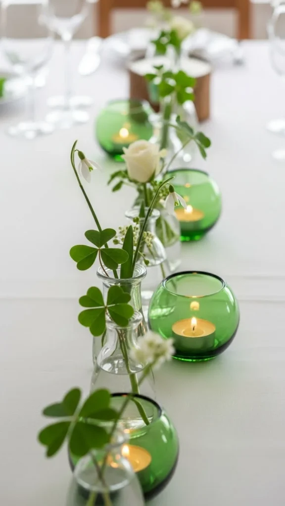
17. Green Glass Bottles as Vases
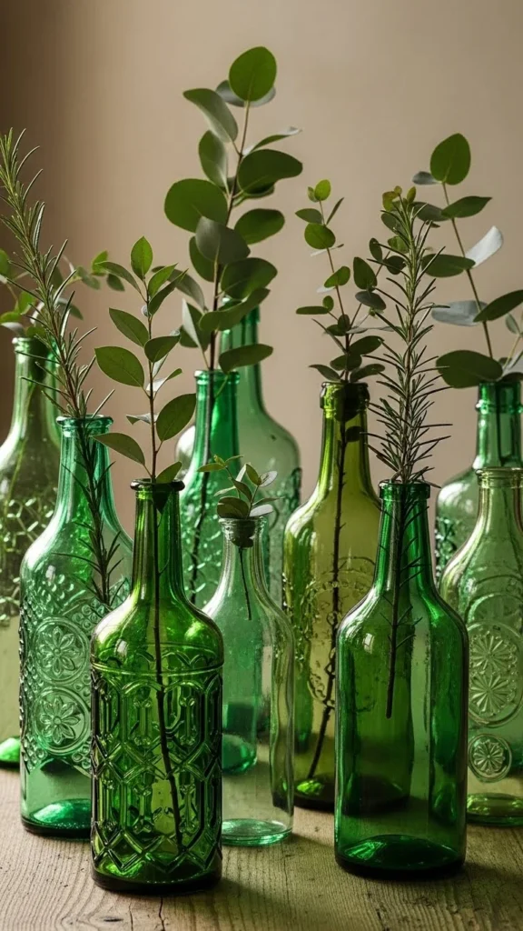
Glass bottles feel collected.
Budget tip: Save bottles from floral shops.
Vary heights slightly.
18. Neutral Placemats with Clean Lines
Placemats define space.
Budget tip: Paper fiber mats work well.
Keep shapes consistent.
19. Matte Ceramic Pitcher Centerpiece

Pitchers feel casual yet styled.
Budget tip: Use everyday pitchers.
Fill loosely.
20. Layered Dessert Plates
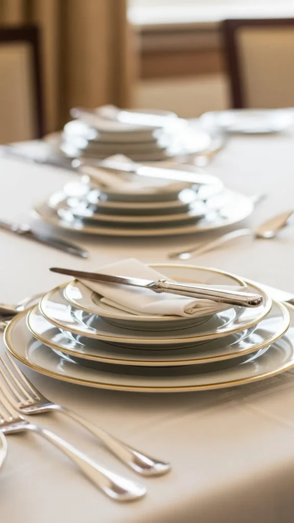
Stacks add height.
Budget tip: Mix plate sizes.
Align stacks carefully.
21. Soft Green Fabric Chair Ties
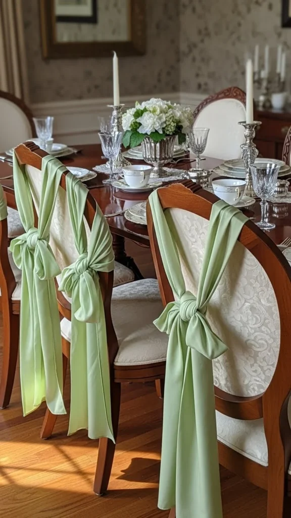
Chair decor frames the table.
Budget tip: Use fabric strips.
Tie loosely.
22. Minimal Table Numbers or Symbols

Keep symbols abstract.
Budget tip: Paper cutouts work well.
Use one style only.
23. Ceramic Salt Cellars

Functional pieces add charm.
Budget tip: Repurpose small bowls.
Place evenly.
24. Textured Glassware

Texture replaces color.
Budget tip: Mix patterns carefully.
Keep tones clear.
25. Green Botanical Prints Nearby
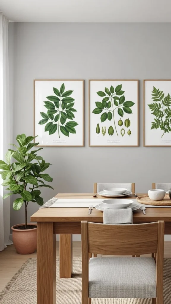
Wall styling supports the table.
Budget tip: Print free artwork.
Keep frames neutral.
26. Neutral Cloth Underlayers

Underlayers add depth.
Budget tip: Use runners or scarves.
Keep edges uneven.
27. Stone or Ceramic Napkin Weights
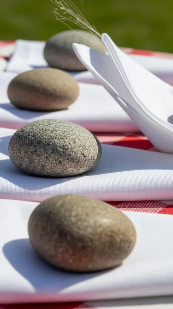
Weights feel intentional.
Budget tip: Use smooth pebbles.
Stick to one color.
28. Balanced Empty Space
Empty space is part of the design.
Budget tip: Remove one item after styling.
Let the table breathe.
Conclusion
A designer-feeling St. Patrick’s Day table comes from restraint, repetition, and thoughtful textures—not themed extras. By focusing on linens, ceramics, greenery, and calm color choices, you can create a setup that feels polished and welcoming. Try one or two ideas, then layer more as time allows. Save your favorite looks and build your table slowly for a result that feels collected and intentional every year.

Leave a Reply